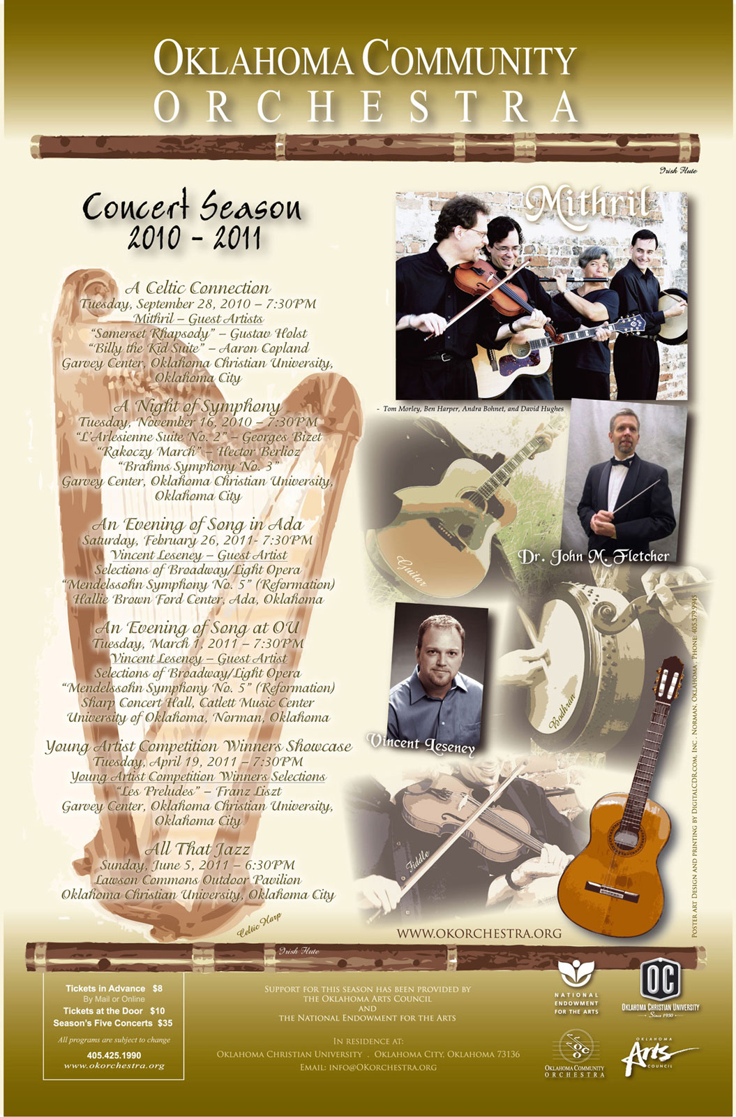
All artwork on this page was created using a combination of Adobe Illustrator and Photoshop CS4. Photos were retouched using Photoshop. Illustrator was used to create the text because most of my art was submitted for printing. Since Illustrator uses vector graphics, the text needs to be as sharp as possible for CMYK printing.
This poster has a combination of gradients, drop shadows and opacity which were created in Illustrator. All photos as mentioned before, were done in Photoshop to balance the color and levels. The Harp was originally golden, but since the customer wanted a gold background, it would have been difficult to see. Using the "selective color" option in the Images menu, most of the yellow had been removed to give it a bronze effect.
I prefer not to use drop shadows on small text including script style, but this is what the customer preferred. But, when using Illustrator vector text, I knew it would print well for easy reading.
T-Shirt design is similar to printing on paper, however it is best to not get carried away with too much ink on a shirt. I have worn shirts that have the entire center part of the shirt covered in ink that does not allow it to breath. Try wearing a black shirt with a solid blob of silkscreen print in the summer and prepare to be dripping sweat from your torso only.
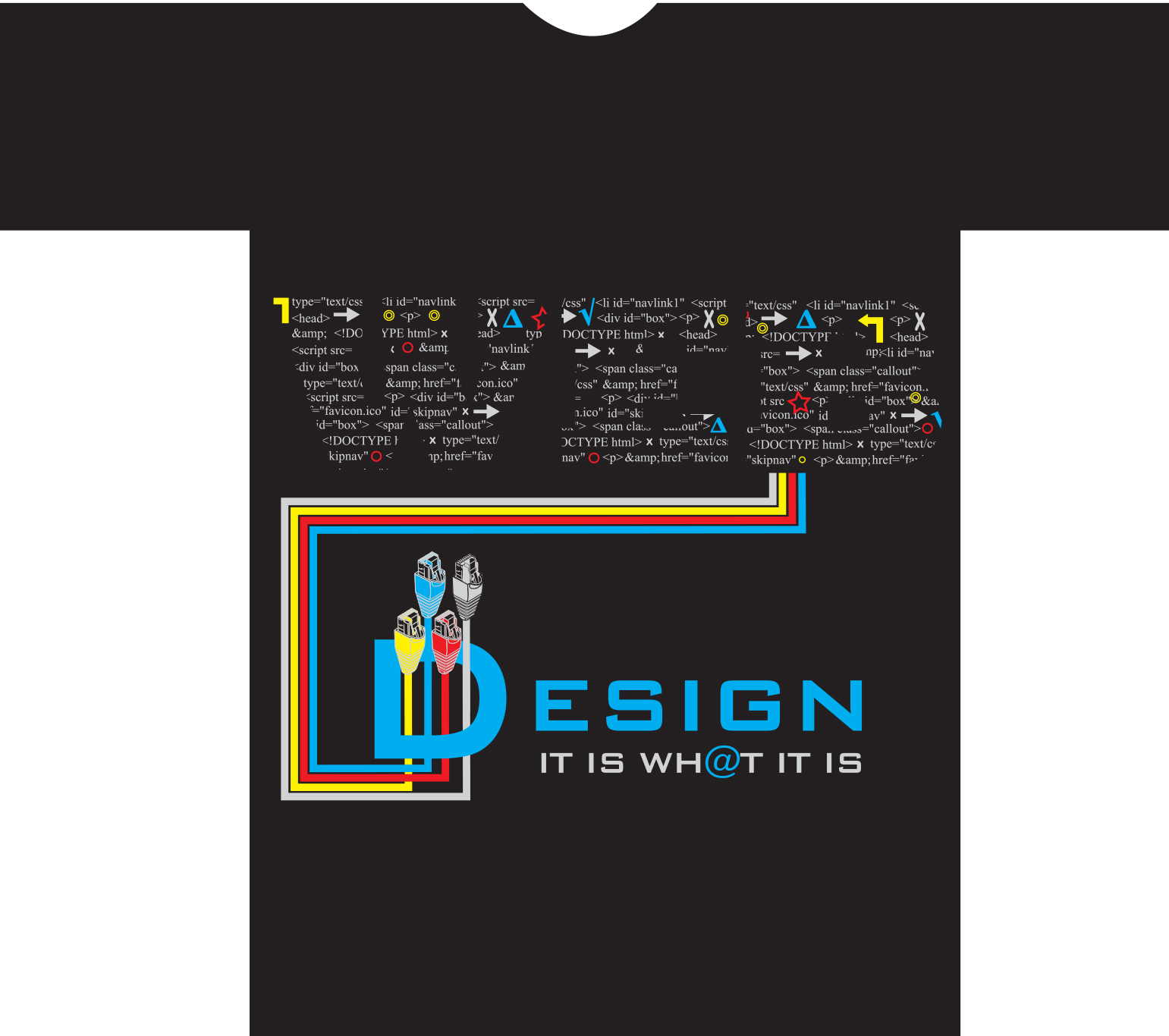
This T-Shirt design was created using Illustrator CS5. I typed the word "WEB" using a large font and converted it to a path. I created a text box and copied some HTML code from my web site. I justified the text and placed it over each letter of "WEB" and created a clipping mask so it would fit inside each of the large letters. The CAT-5 cables were originally a photograph. I used Illustrator's Live Trace feature to convert it to paths and was able to fill in the colors and output a vector image. This shirt uses four spot colors using solid yellow and Cyan. To get a solid red requires 100% Magenta and 100% Yellow. Gray color was simply 50% Black (K). This design won 1st place at School.